Stopping in to share a watercolored image by Brandy using her Dear Apple Gorjuss stamp. I just love the bright blue and red in this image - stunning. This image is so charming, it has inspired us both to some really pretty images. If you haven't checked out the Gorjuss, give them a try. They stamp like a dream and are fun to play with.
Background
Monday, February 29, 2016
Apple of my Eye
Stopping in to share a watercolored image by Brandy using her Dear Apple Gorjuss stamp. I just love the bright blue and red in this image - stunning. This image is so charming, it has inspired us both to some really pretty images. If you haven't checked out the Gorjuss, give them a try. They stamp like a dream and are fun to play with.
Sunday, February 28, 2016
Our Beautiful World - Colors
Quick post today to share these photos from our trip last year to the island of Oahu, Hawaii. I was inspired by the word prompt over at Our Beautiful World - Colors. We stopped by Matumoto's for a shaved ice one day while visiting the North Shore. I've surely had shaved ice before. However, the experience - whether because of the pleasant exhaustion of having been out and about for the day or the warm, balmy weather (we were there for the trade winds which are slightly warm, but not to our Arizona standards for hot) - is extremely satisfying. My husband and I shared a bowl and fought the kids for a taste of theirs too.
As you can see - the beautiful colors of our treat were savored by everyone. We'd recommend to anyone and will make it a stop whenever (if ever) we get into town again!
What's going on in your part of the world? Anything colorful? Come share with us or just stop by to see what's shared by others.
Saturday, February 27, 2016
More Rubbernecker Watercoloring
I shared in this post where I'd made a card set with my Wildflowers in the Wind Rubbernecker stamp set. I had some leftovers and decided to create these two cards using my Flowers in the Wind stamp set. The technique is the same as that detailed in the previous post - an easy technique that is useful in making me look like a pro. This first card used Peeled Paint and Worn Lipstick Distress inks on the flowers and Hickory Smoke and Faded Jeans Distress Ink on the background.
This second card used Hickory Smoke and Faded Jeans on the background and Peacock Feathers and Peeled Paint on the flowers. The strip of color was created using the flower color and clear embossing powder. The silver is a silver and black embossing powder. They make the perfect accent to these images. I am so pleased with how these turned out!
I decided to enter Simon Says Stamp's Wednesday Challenge Anything Goes. Come join the fun.
Friday, February 26, 2016
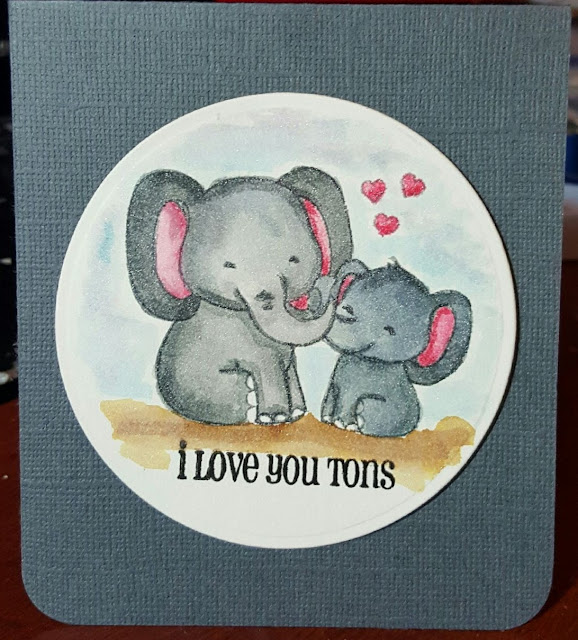
I Love You Tons
Brandy whipped up this adorable card recently to lift her son's spirits. We all need a pick-me-up once in a while and who wouldn't smile despite challenges if you received this card?
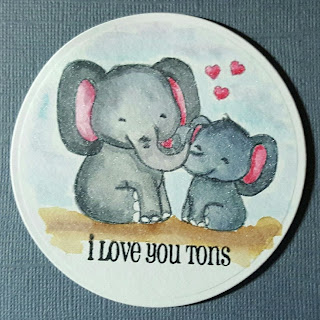
I believe the Clearly Besotted Love You tons image was watercolored with the Clean Color Real Brush markers onto watercolor paper. A simple Spellbinders circle die cut to finish the image off and a lift of foam tape off the grey cardstock card. Proof that crafting doesn't have to take hours and hours to charm and communicate love.
Who in your life needs a pick-me-up? What adorable crafting tool is just begging to be used? I say, pick them up and use them. Making cards is a way to communicate with those in our lives. Look for a way to care, to share, to encourage. Go, something done.
Brandy decided to enter Simon Says Stamp's Wednesday Challenge Anything Goes. Come join the fun.

Thursday, February 25, 2016
City Crafter Challenge #300 - Polka Dots Making a Card Set
I'm back again with my last card for the month long guest designer spot at the City Crafter Challenge Blog. This month has flown by, but I can say that I've been challenged and inspired. I'm so grateful for the opportunity to join. For this last challenge, my card is a little more abstract in the take on the inspiration. The challenge is to create a card or project and add polka dots to your project (patterned paper, stamps, etc.). We've this inspiration photo to work from:
I went shopping in the Scrapbox and found this blue embossed cardstock. Once I made the original card for the challenge, I knew I wanted to replicate the design and cread a card set that I could give as a gift. Thus, the two cards I am sharing with you today were born.
Just like the challenge card, I started the image by stamping the container onto Strathmore watercolor paper. I followed the techniques in this video to soften the color and place and soften the flowers from the Flower stamp set. The grass was created using the Foliage stamp set. All images were stamped using Distress Inks (Peeled Paint, Antique Linen, Shaded Lilac, Worn Lipstick, Faded Jeans, and Seedless Preserves). I have a small size 3 watercolor brush I used for all the images. I used my SSS Stitched Rectangles dies to die cut the image and the grey mat.
I'm not as big a fan of this large barrel, but I think I made it work, don't you? The Art Impressions stamps are so easy to use - anyone can make a beautiful work of art using these stamps. My cards are proof! If you haven't given them a try, I highly recommend the entire set.
Please come join the City Crafter Challenge Blog for another challenge- what inspires you from the photo? Be sure to use polka dots somewhere on your project. I can't wait to see you over there.
I decided to join the Simon Says Stamp Wednesday Challenge Anything Goes. Come join the fun.

Tuesday, February 23, 2016
City Crafter Challenge 300 - Polka Dots
I'm back again with my last card for the month long guest designer spot at the City Crafter Challenge Blog. This month has flown by, but I can say that I've been challenged and inspired. I'm so grateful for the opportunity to join. For this last challenge, my card is a little more abstract in the take on the inspiration. The challenge is to create a card or project and add polka dots to your project (patterned paper, stamps, etc.). We've this inspiration photo to work from:
I super love grey and mint green. However, I decided to go in a different direction when I couldn't find just the right color of mint color. Instead, I went shopping in the Scrapbox and found this blue embossed cardstock. It definitely has polka dots and I used the color to inspire my focal point image.
I started the image by stamping the container onto Strathmore watercolor paper. I followed the techniques in this video to soften the color and place and soften the flowers from the Flower stamp set. The grass was created using the Foliage stamp set. All images were stamped using Distress Inks (Peeled Paint, Antique Linen, Shaded Lilac, Worn Lipstick, Faded Jeans). I have a small size 3 watercolor brush I used for all the images. I used my SSS Stitched Rectangles dies to die cut the image and the grey mat. Turns out I was also somewhat inspired by the colors in the image.
Please come join the City Crafter Challenge Blog for another challenge- what inspires you from the photo? Be sure to use polka dots somewhere on your project. I can't wait to see you over there.
Monday, February 22, 2016
A Hello Birdi-ful Card Set
As you know, I've simply gone ga-ga over the watercoloring. Brandy and I are both enamored with the various techniques and have invested in a couple of different supplies in the last several months. I put all of this to good use to make these valentine's for my co-workers. It's taken me some time to upload and edit these photos with my guest design work over at the City Crafter Challenge Blog, but I finally got it all done.
I cut a heart shape out of some scrap paper and used it to trace the shape onto some Arches watercolor paper. Brandy and I have discussed her watercolor class and the recommendation that a professional grade watercolor, like Arches,
can make a big difference in your watercolor projects. I found that to be especially true for me when creating this kind of blended wash. The water and color just flow better on the Arches paper. If you look at each card you can see more or less success in the blending. A couple came out with blooms that I would call mistakes but in the end become interesting texture and color in the finished heart.
I used three primary tube watercolors to create the colors - blending to make purples and some of the darkness in the blues. All in all, I'm pleased though I think there is significant room for improvement.
The sentiment, birds and branch are all stamped onto the Arches watercolor paper using my new Greeting Farm Tweety Pie stamp set. I colored the images with the same watercolors, blending to create shades of red, orange and purple. I am super pleased how the birds blended to highlight the breasts of the birds. Brown was a little difficult to make, so the branches come across a little flat. Still, a fun project and a good excuse to practice my skills.
The sentiments were all stamped onto the hearts once the watercolors dried using black Archival Ink and Crimson Close to My Heart ink.
The ladies at work loved these cards, filled with small Dove chocolate hearts. A small treat in a week filled with Valentine's fun. I hope your day was special. Wishing you happy, watercolor filled crafting!

Sunday, February 21, 2016
Our Beautiful World - Sweet
The ladies over at Our Beautiful World have a new word prompt. This week the word prompt is "Sweet". I thought I'd share these photos of butterflies at the Desert Botanical Garden from last year. This photo shows them enjoying a sweet treat.
The enclosure is full of butterflies. They were varied in color, shape and sizes. There was a lot of movement because there were so many of us in the enclosure with them. It was tough to get a good clear pictures, but these remind me of the experience, which is the major reason I take photos.
What does the word "sweet" bring to mind? Snap a photo and join up with all the fun over at Our Beautiful World.
Saturday, February 20, 2016
City Crafter Challenge 299 - Negativity A Card Set
Hello. I'm back again with a card set inspired by the City Crafter Challenge Negativity. The challenge provides the following picture as inspiration:
and requires the use of the negative space created by a die cut. In this case, I used my paper trimmer to create this "negative" frame. Rather than popping the flowers up, I popped the background forward and created a little window through which to see my lovely petunias. Here's the details which are the same as the card shared earlier in the week:
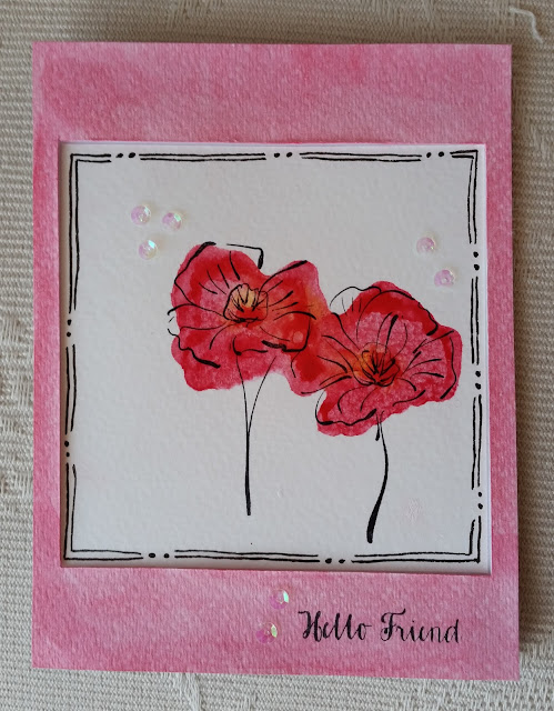
- I used my Prima Oil Pastel crayons by coloring directly onto the solid background stamp of my Rubbernecker Petunia stamp set. I used the bright yellow in the center and the redish pink around the yellow - coloring like I was filling the image in. I then spritzed the stamp with a mister and used a damp brush to dab at the stamp to activate and blend the colors. On this first card, I mixed too much and the red overwhelmed the yellow. I then stamped onto Strathmore watercolor paper.
- When the image was dry, I stamped with Archival Black ink the outline image and embossed with clear embossing powder. I used a similar technique to this video except that I used the oil pastels to color.
- I then cut the image out of the paper using my paper trimmer. I had drew in the black lines/dot pattern with a black marker and adhered the sequins with some clear glue.
- I colored the rest of the watercolor paper with a watercolor brush and the orange oil pastel, stamping the sentiment in black Archival ink once dry. I used a piece of craft foam to evenly raise the frame around the flowers.

Inspired by all the color in the photo, I decided to experiment with the crayons and the various color combinations.
Probably my favorite of the set, but not the best photos I've taken. The sequins do a good job of picking up the color on the card too.

This card is probably the most striking in person. I'm not a fan of orange, but it really works in this card. I ran out of space due to some shortsighted paper trimming and ended up with just one line in the frame. It works too, I think.
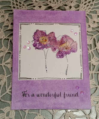

This last photo is the worst of all. I ended up giving this card to Brandy who is recuperating from a minor surgery. She's healing wonderfully and I just wanted to celebrate her and our friendship while giving her a cheer up. I think this card (her favorite color, purple!) sent the message intended.
I have super enjoyed my time as the guest designer for the City Crafter Challenges this month. I can't believe how much fun it was to play with color and create this card set. I think I will send a couple of these over for the Lasting Hearts Card Drive over at Jennifer McGuire's blog.
I hope you are inspired to join us too. Use the leavings from your die cuts - the negative part - and make something beautiful. You could always send it in for a wonderful charity like Lasting Hearts. Just don't forget to link up with the City Crafter Challenge, you've three short days left to join the fun. I'll look forward to seeing you over there.
I hope you are inspired to join us too. Use the leavings from your die cuts - the negative part - and make something beautiful. You could always send it in for a wonderful charity like Lasting Hearts. Just don't forget to link up with the City Crafter Challenge, you've three short days left to join the fun. I'll look forward to seeing you over there.
Subscribe to:
Posts (Atom)
