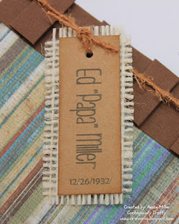
My MIL asked me to put together a save the date/invitation for my FIL's 80th birthday celebration. What an honor! I have been so inspired by Stephanie who blogs over at Burlap Kisses that I just knew that I wanted to incorporate burlap into the final product. This is my final result.

The stripped patterned paper comes from open stock at my HL. I hand-folded the strip of brown cardstock after scoring the paper using my Score-Pal. Brandy (brilliantly!) pointed out that I should have scored the 8 1/2 x 11 brown cardstock and then cut strips to 1 in. That's why she's the best friend, ladies and gentlemen! Needless to say, I only made about 20 of these cards and mailed them out a few weeks ago. The sentiment was printed onto non-textured white cardstock using my computer. I used the Word trick of placing text boxes with the images/sentiment inside.
I use Office 2010. The "lovely" Drawing Tools ribbon (in orange above) and the Picture Tools ribbon both provide the commands to manipulate the text boxes. I'm a fan of moving them around on the page and printing a test version until everything is in the right place. You can click and drag to highlight certain words and change the font or size to mimic any scraplifted image. If you don't have a large variety of fonts on your computer, stop by Creating Keepsakes each Friday and download their free font over at Free Font Friday. It may take a few weeks to increase your selection, but most word processing software come with a variety of fonts that can create a close approximation.

I use the same method to create this menu selection and instructions for RSVP that was adhered to the back of the Save the Date card. My MIL, Pat, decided that since almost every single attendee was family who was already aware of the event she wanted to combine the save the date with the invitation and save a little postage. The border came straight out of Word's Clip Art-another source of images that are free!
I found this YouTube video that explains text boxes using Word 2007. I believe much of the instruction is similar and works for 2010. The key here is to play around and make things work. I find it easier to make several small text boxes that I can size and place with my mouse rather than one big text box with lots of different formatting. Give it a try. It is a cost effective alternative to purchasing lots of stamped sentiments and gives you the flexibility to make your own invitations with instructions for your guests.
I've used this technique a couple times before. You can see some examples:
Using clipart and words on a autumn card
Making place cards using Word and Fill the Page cuts with the Cricut
Using watermarked images to make a background
Using the text box color to make an image
I've entered this card in Our Daily Bread Designs (ODBDS) challenge- Make a card or project for the men.
Andie


WOW - Andie, these are awesome. I love the colours and the burlap gives it that extra touch but stays masculine:-) TFS
ReplyDeleteThis comment has been removed by the author.
ReplyDeleteWow I love this Gorgeous Masculine Card!! The Brown paper with the blue,brown, and Green!! I love the Color combination...
ReplyDeleteThanks for Joining the ODBD Shining the Light challenge!!
Hugs,
Chris